1. Overview
Problem Statement
Young adults (aged 18–20s) rarely visit Zealandia, and when they do, it’s typically a one-time experience.This trend suggests that Zealandia may not currently align with the interests or priorities of this age group, potentially due to a lack of awareness, perceived relevance, or engagement opportunities that resonate with their lifestyles.
Solution
We wanted to re-imagine its brand identity to resonate with younger audiences, highlighting Zealandia as a serene escape from city life. This included social media push and pull marketing, an engaging mascot, and innovative digital tools to enhance the visitor experience.
My Role
My role is to create an AR map guide visitors through Zealandia’s unique attractions via their smartphones and develop a cohesive set of icons to represent various locations and features within Zealandia, ensuring they aligned with the refreshed brand aesthetic. Additionally, I was responsible for creating an animation for the logo.
2. Design Process
For this project we used the Double Diamond method.
Research & Inspiration
To inform the design of the AR map and icons, I researched current trends in augmented reality applications and way-finding systems, focusing on how digital tools enhance physical navigation. I studied examples of user-friendly AR interfaces and analyzed effective iconography, prioritizing clarity and scalability.
3. Prototype
I created initial wireframes, followed by hi-fi with Figma, so I can test out the product
Low-fi Mobile, Way-finding map
Hi-fi Mobile, Way-finding map
4. Usability Testing
To evaluate the effectiveness of the map, I conducted usability testing to observe how how people interacted with the map and ensure it aligned with the needs of our target audience.
STYLE : MODERATED
Main Tasks I asked to complete
• Find the menu
• Find "Castle point lighthouse"
• Find "Lake Road and Valley View Track"
Main usability issues
The following changes are a few of the things that I applied based on the testing feedback
Usability Issue 1
"It's a little hard to find the option for the menu and the buttons are getting lost in the background"
To resolve this, I created a gradient background for the top bar.
Before, top bar was hard to see
After, added a gradient background to make the top bar more visible and easy to find
5. Final Results
Problem
Zealandia Te Māra a Tāne faced a challenge in attracting younger visitors and communicating its unique value as an urban sanctuary amidst the hustle and bustle of city life.
Solution
To address these challenges, our team created a refreshed brand identity that positioned Zealandia as an accessible oasis for young, urban audiences. The solution included a modern logo, friendly typography, and an engaging marketing campaign featuring social media strategies and vibrant posters around the city. To enhance the visitor experience, we introduced an interactive AR map and cohesive iconography, making navigation intuitive and fun while aligning with Zealandia’s refreshed brand aesthetic.
Way-finding AR map
Billboard logo animation
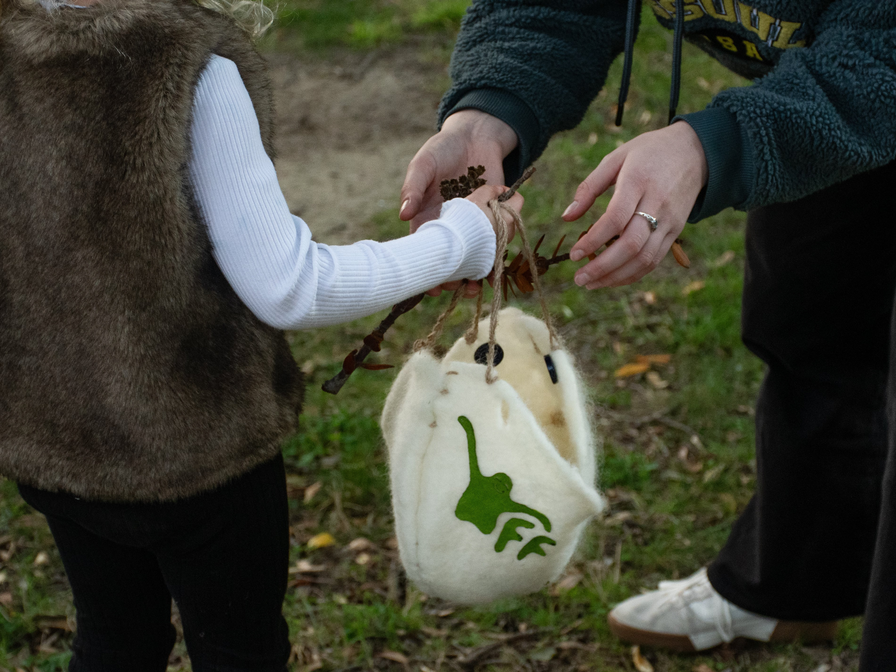
Mascot 'Tara'
Social media post
Poster of Tara escaping the city
Poster of Tara 'exploring the backyard'
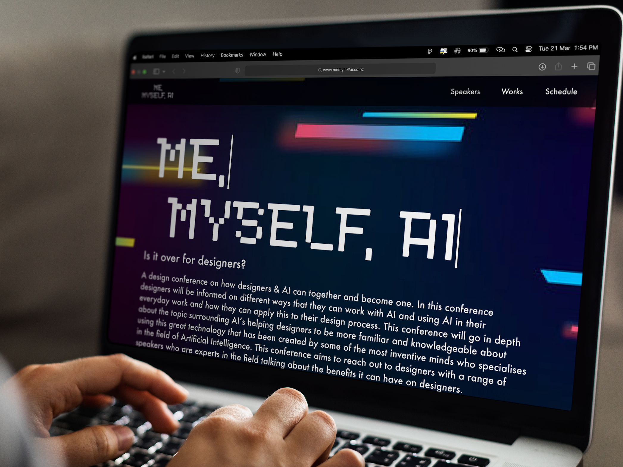
Zealandia website
6. Reflection
Outcome
The successful development of the Zealandia brand refresh brought a contemporary and inviting identity to life, effectively addressing the key challenges of engaging younger audiences and improving the visitor experience. The AR map and icons played a pivotal role in enhancing navigation, making it intuitive and visually appealing, while seamlessly integrating with the new brand aesthetic.
Takeaway
This project taught me the importance of integrating digital innovation into branding to enhance user engagement. Designing for AR pushed me to think critically about user interaction in a physical space, while creating icons deepened my appreciation for clear, effective visual communication.
