1. Overview
Problem Statement
I wanted to create a news website that caters to wide variety of audience. My aim is to make an engaging general news website that is easily accessible for users who have an accessibility problem. However, this can pose a challenge as I need to create a design that caters to someone who has an accessibility problem and at the same time still be readable and accessible to a wide variety of audience.
Solution
I ran 6 weeks worth of iterating and development to achieve a news website that caters to a wide variety of audience that has accessibility issues.
Main Features
• Search filter • Weather widget
• 'Sort By’ filter • Toggle for colour blinds
My Role
I started by creating lo-fi prototypes of the website and conducting user testing. Then, I moved on to digital wireframes on Figma. Finally, I conducted a final user test of the website, which helped me to add the final touches to the design.
2. Design Process
For this project we used the Double Diamond method.
3. Empathize
User Interviews
To develop of an understanding of their habits and preferences, and problems, I conducted user interviews with 4 users for 30 minutes each.
STYLE : MODERATED NUMBER: 4 PEOPLE
DURATION: 30 MINS INTERVIEW TYPE: 1:1
Main questions I asked
• What problems do you face when navigating though a webpage?
• Why do you read the news instead of watching the news?
• What device to you use to browse a news site?
Preparation
In order to stay organized and take track of all sessions, I used FigJam.
Key Insights
• One participant said that they have accessibility problems making it harder to navigate the webpage
• Majority of the participants preferred to read the news instead of watching or listening because it’s easier and there is less distractions
• Participants experienced that there were too many options to choose from and didn’t know how to filter them out
• Half of the participants preferred to use their laptop due to work and the other half prefer to use their phone due to the convenience of phones being portable
Based on my findings, the majority preferred to read the news rather than listening or watching the news and half of the participants prefer to use their laptop and the other half to use their phones to find out the current news
4. Define
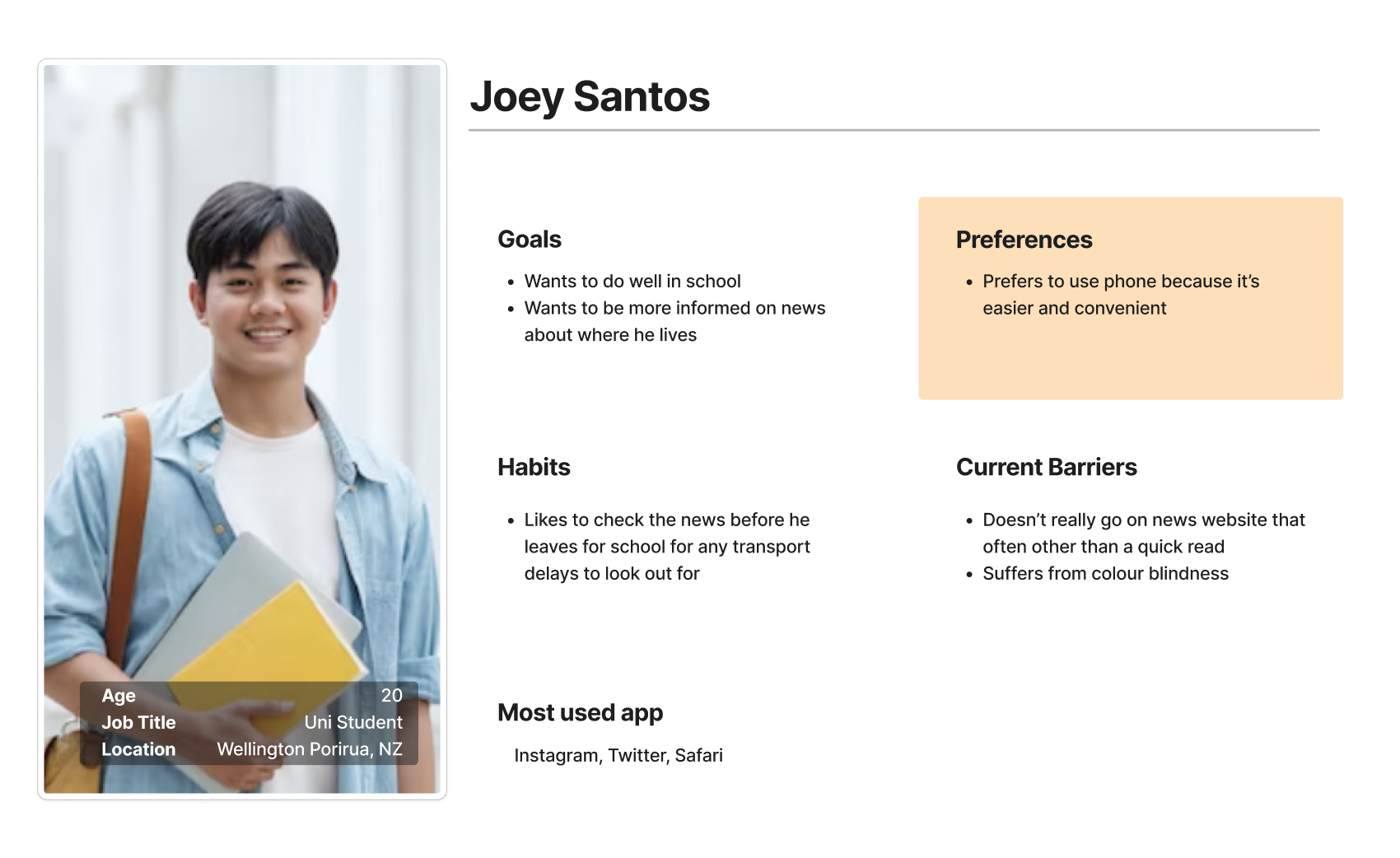
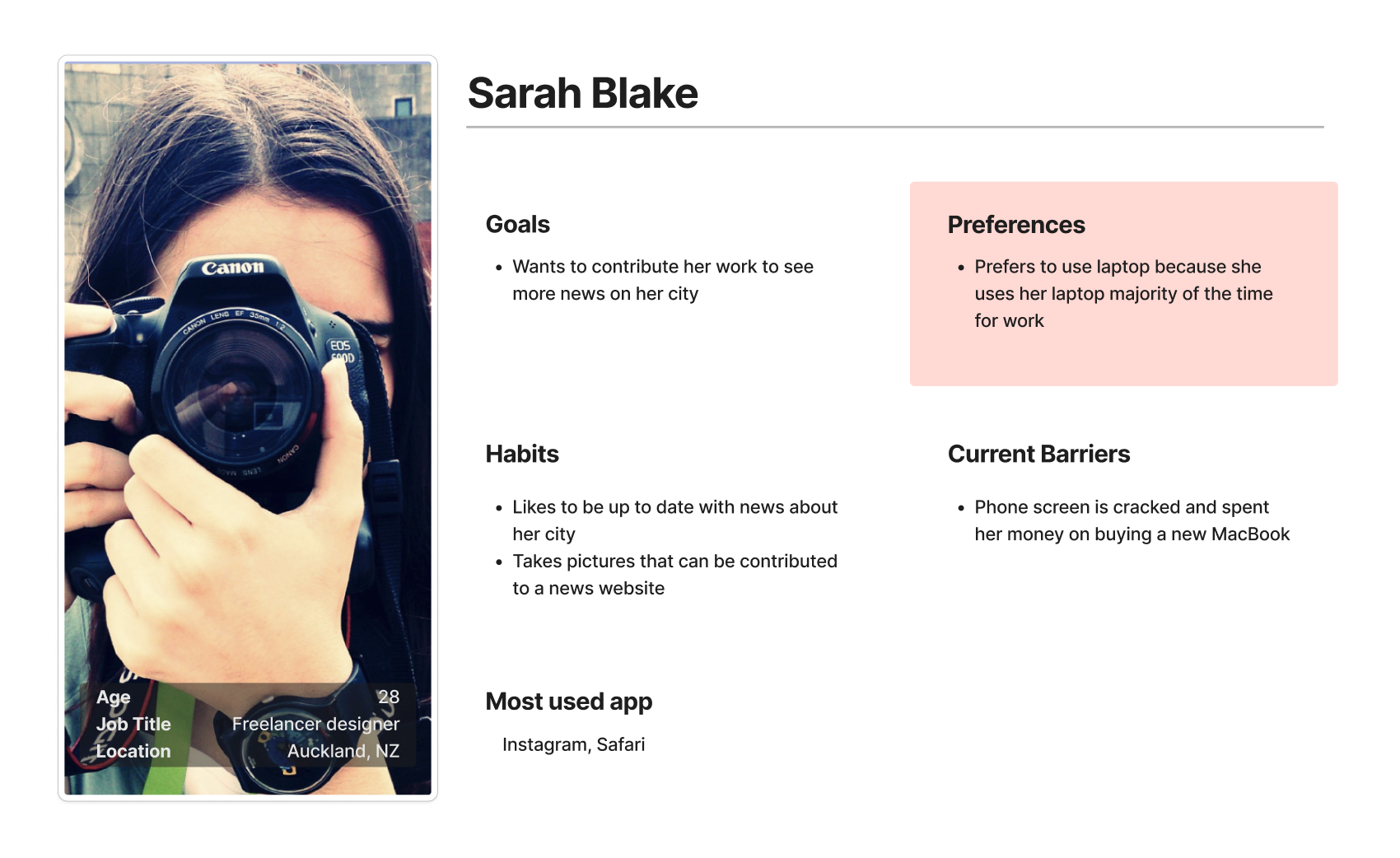
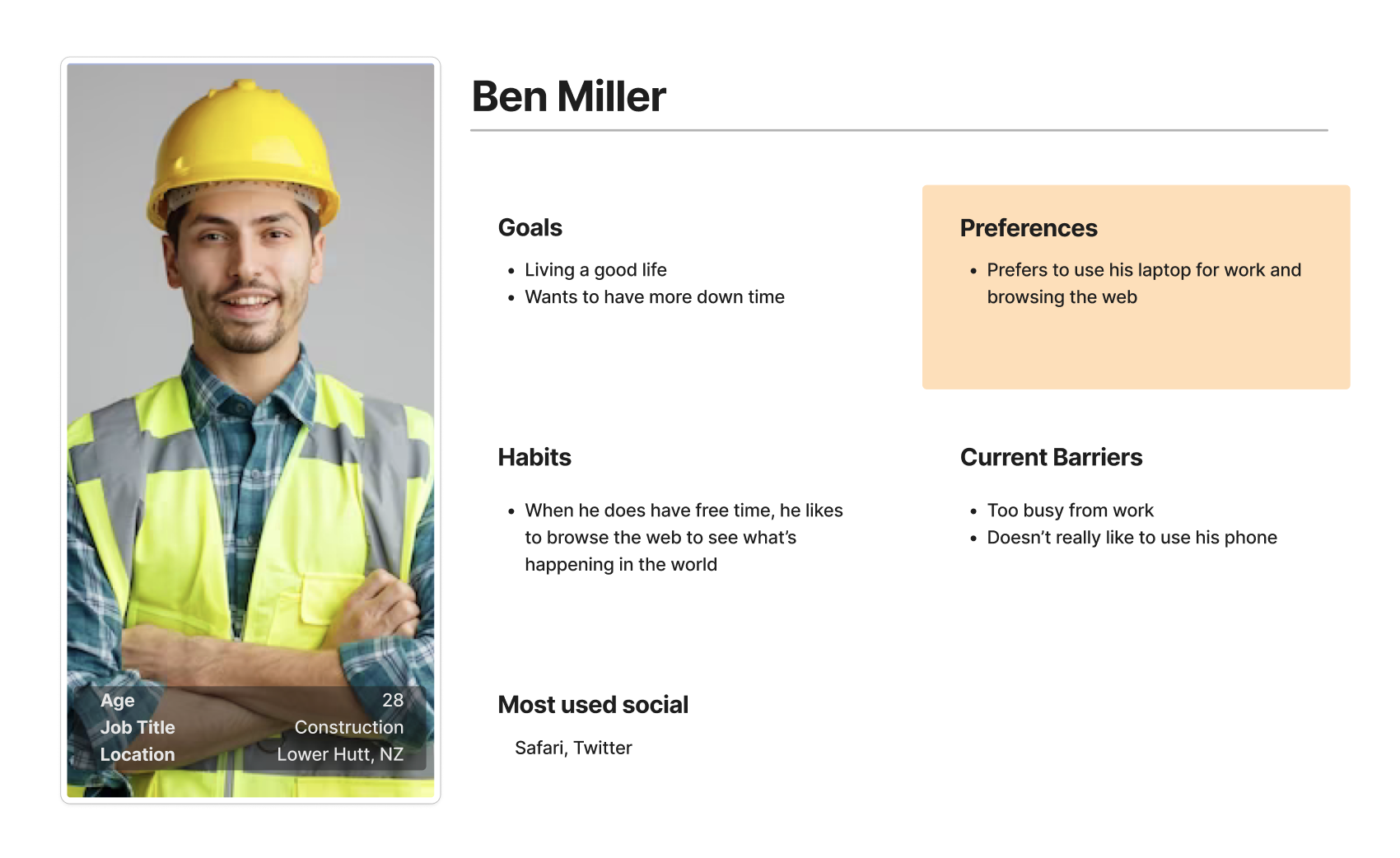
User Persona
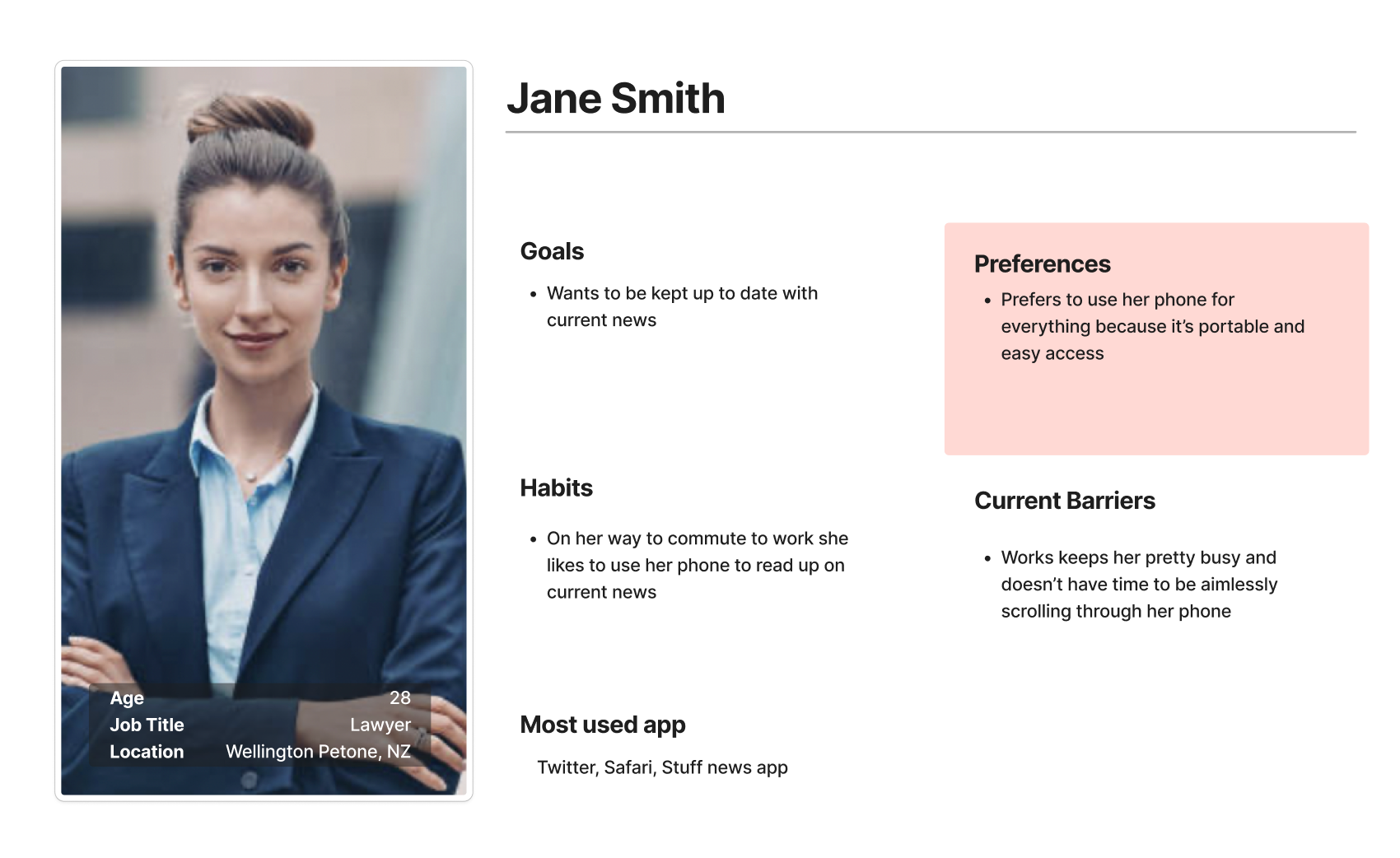
From the user interviews that I’ve conducted, I developed 4 personas that caters to their needs.
5. Prototype
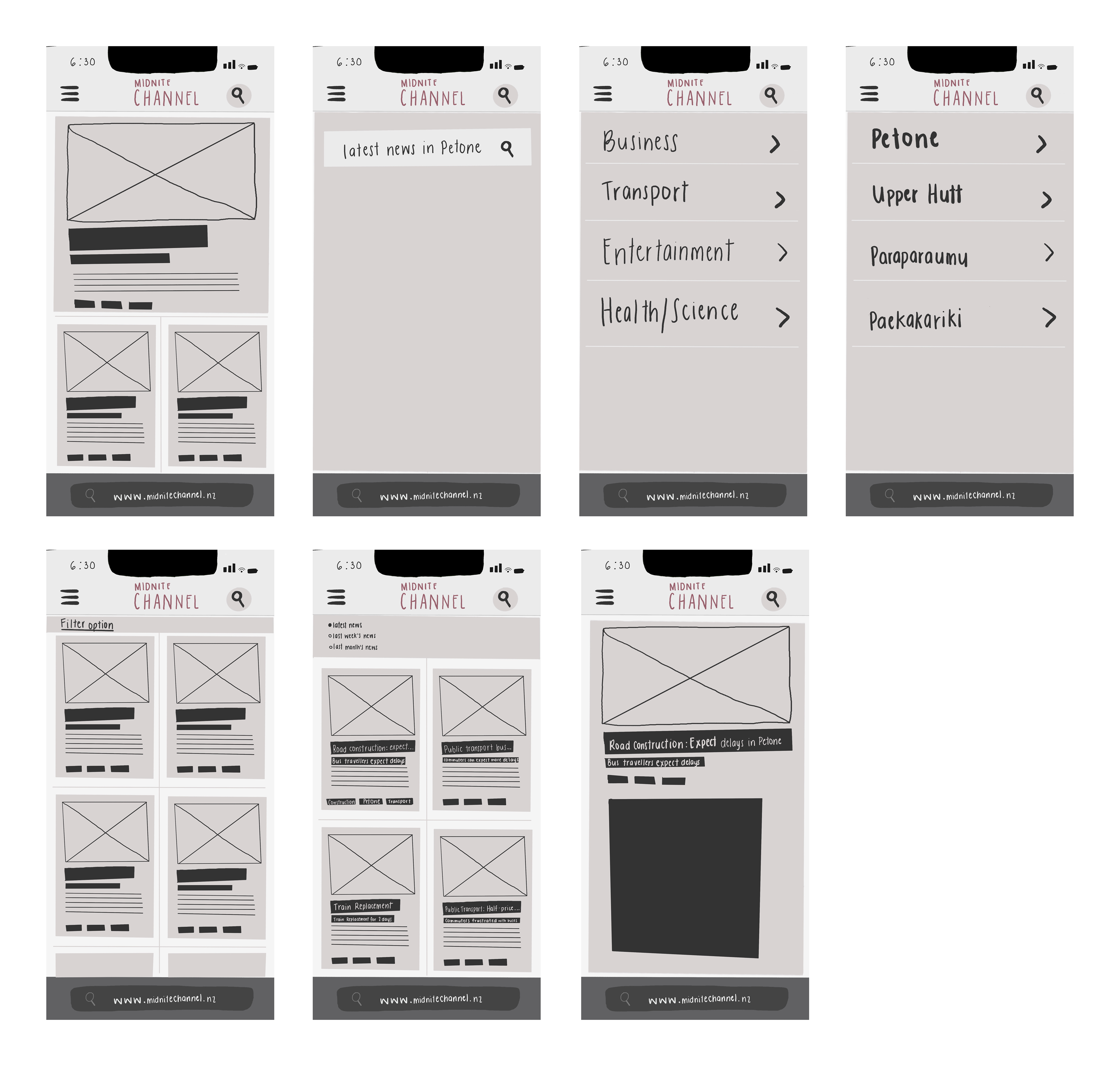
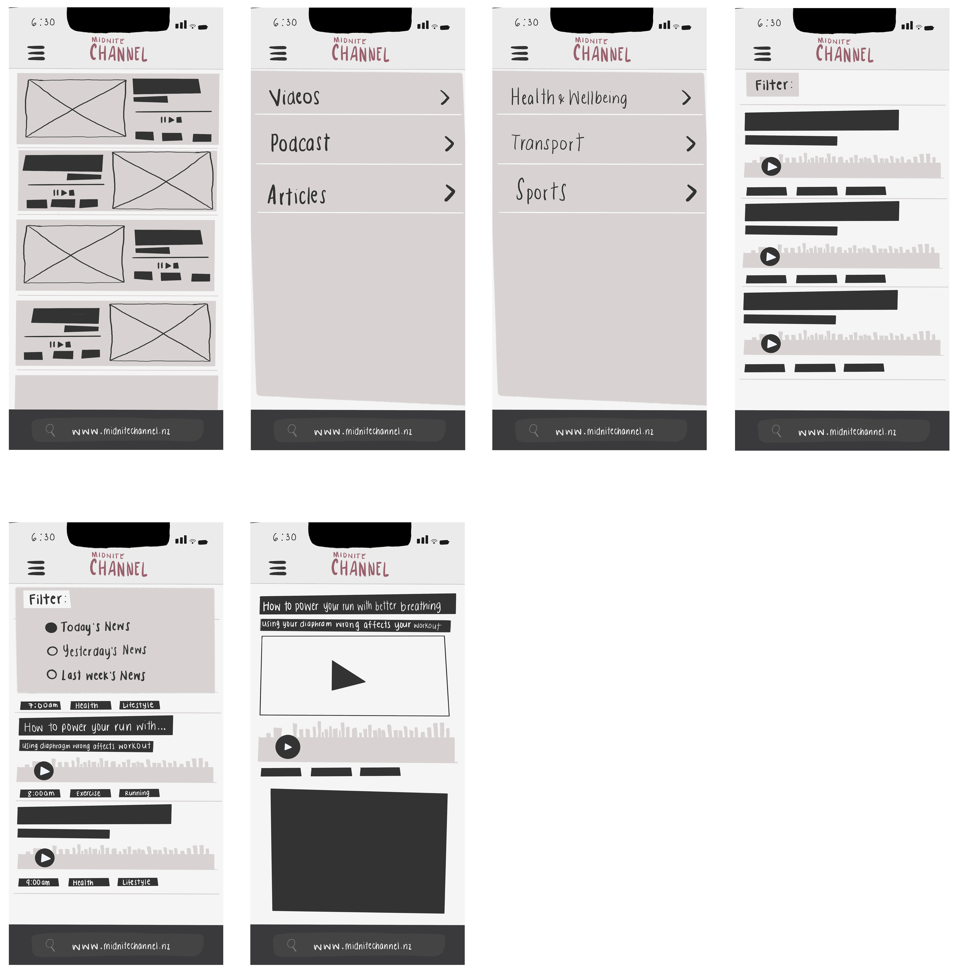
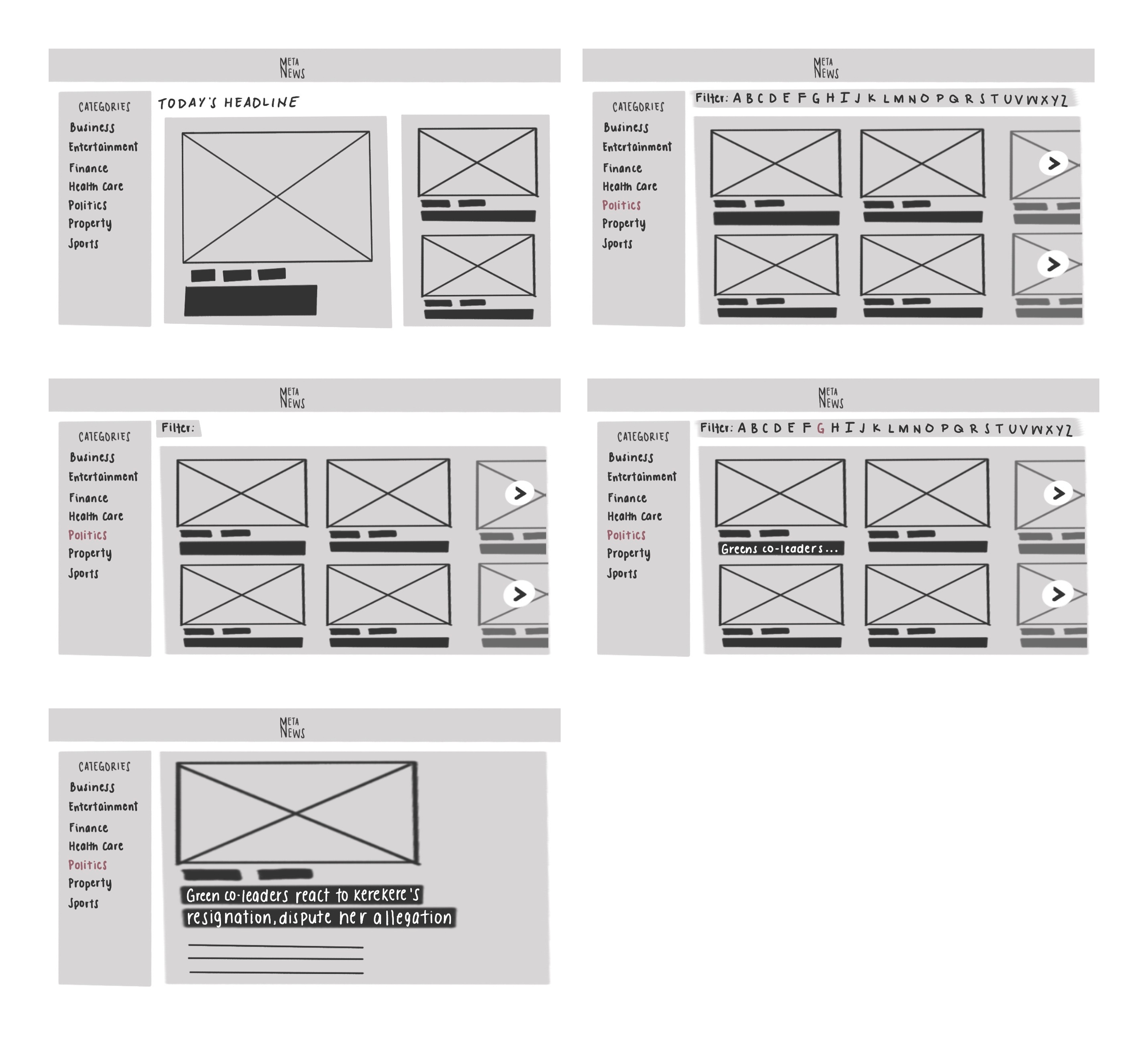
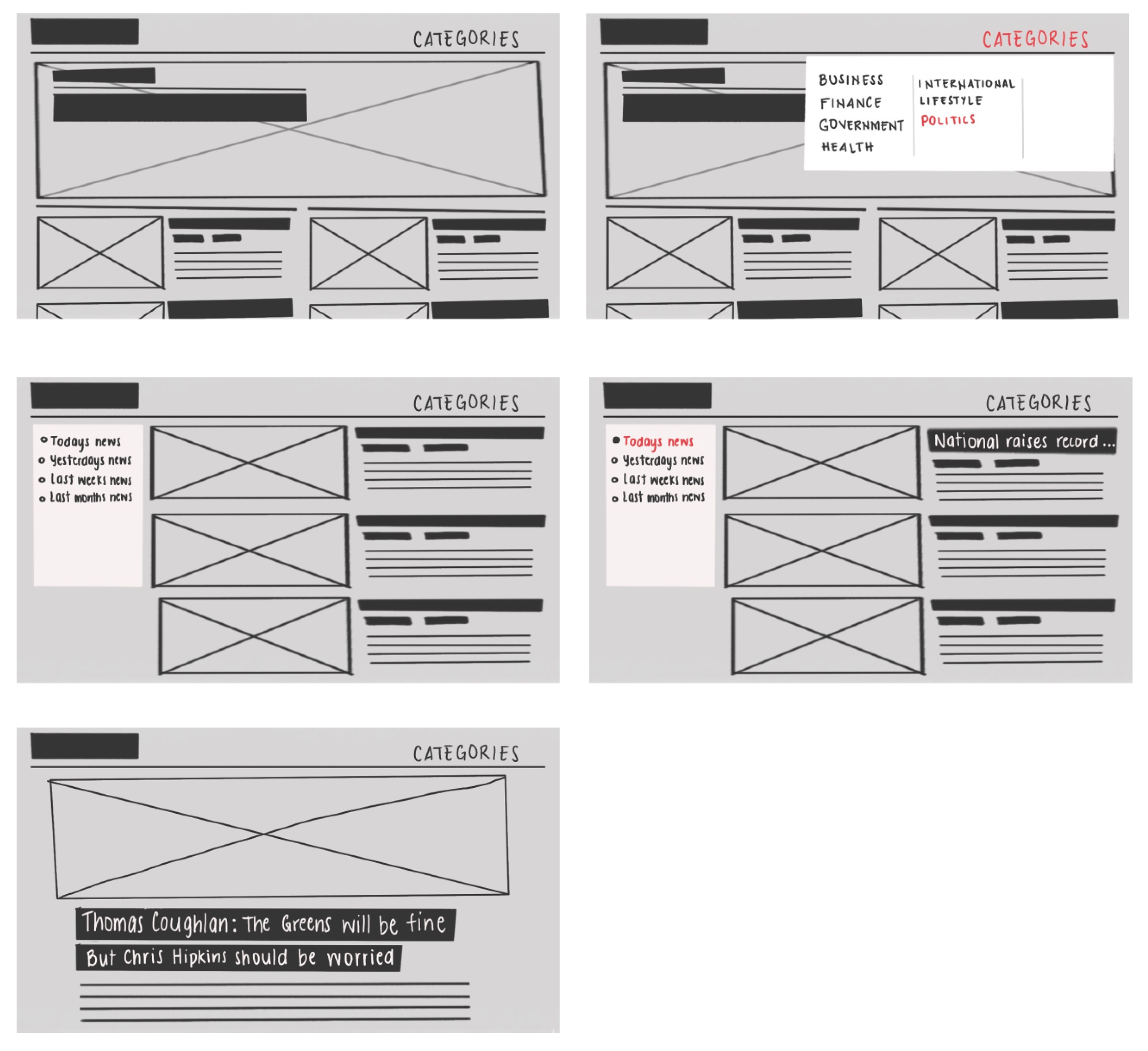
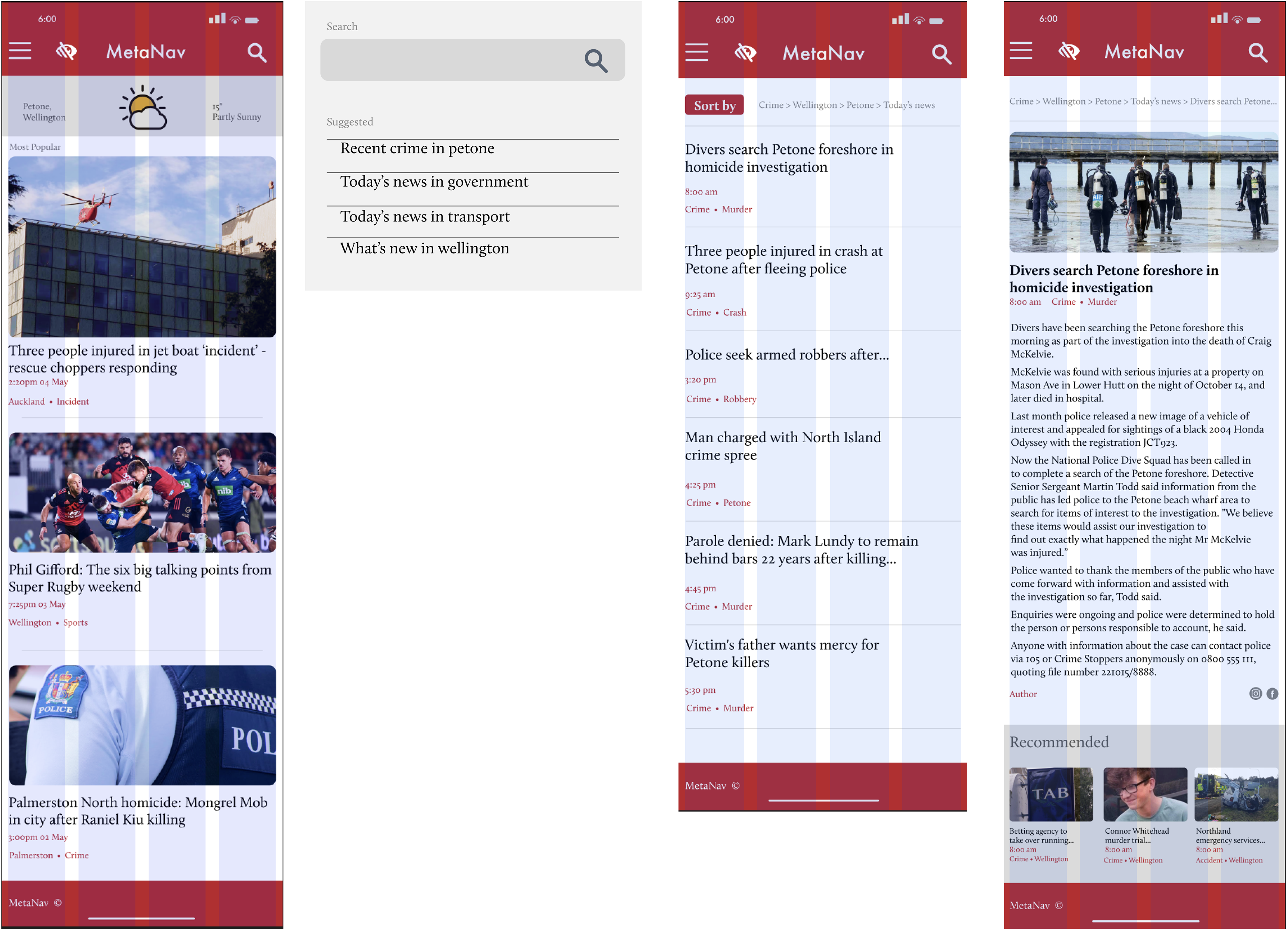
I created low-fi wireframes, followed by hi-fi with Figma, so we can test out our idea
Low-fi Mobile, Jane Smith
Low-fi Mobile, Joey Santos
Low-fi Desktop, Sarah Blake
Low-fi Desktop, Ben Miller
Hi-fi Mobile, Jane Smith
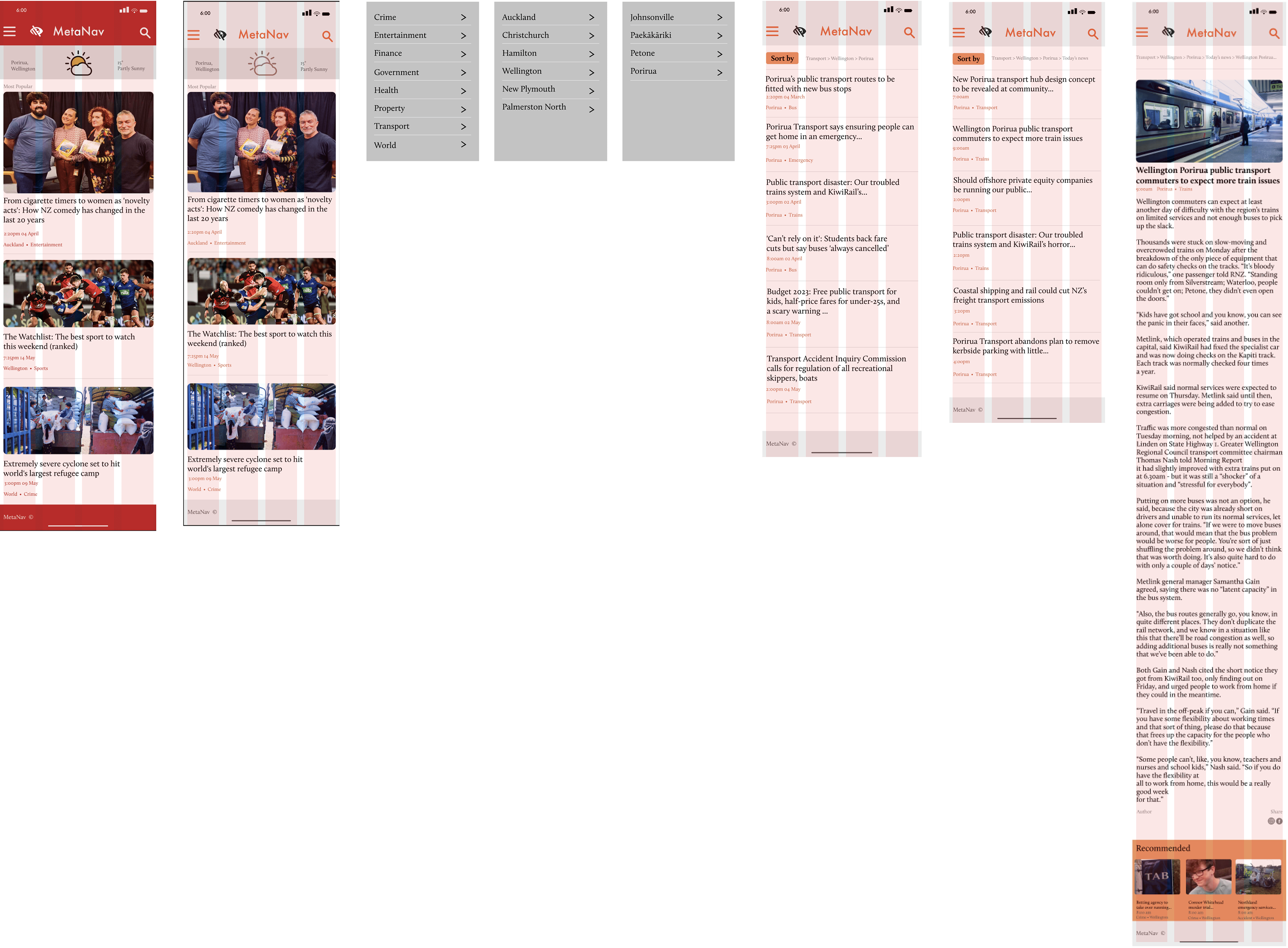
Hi-fi Mobile, Joey Santos
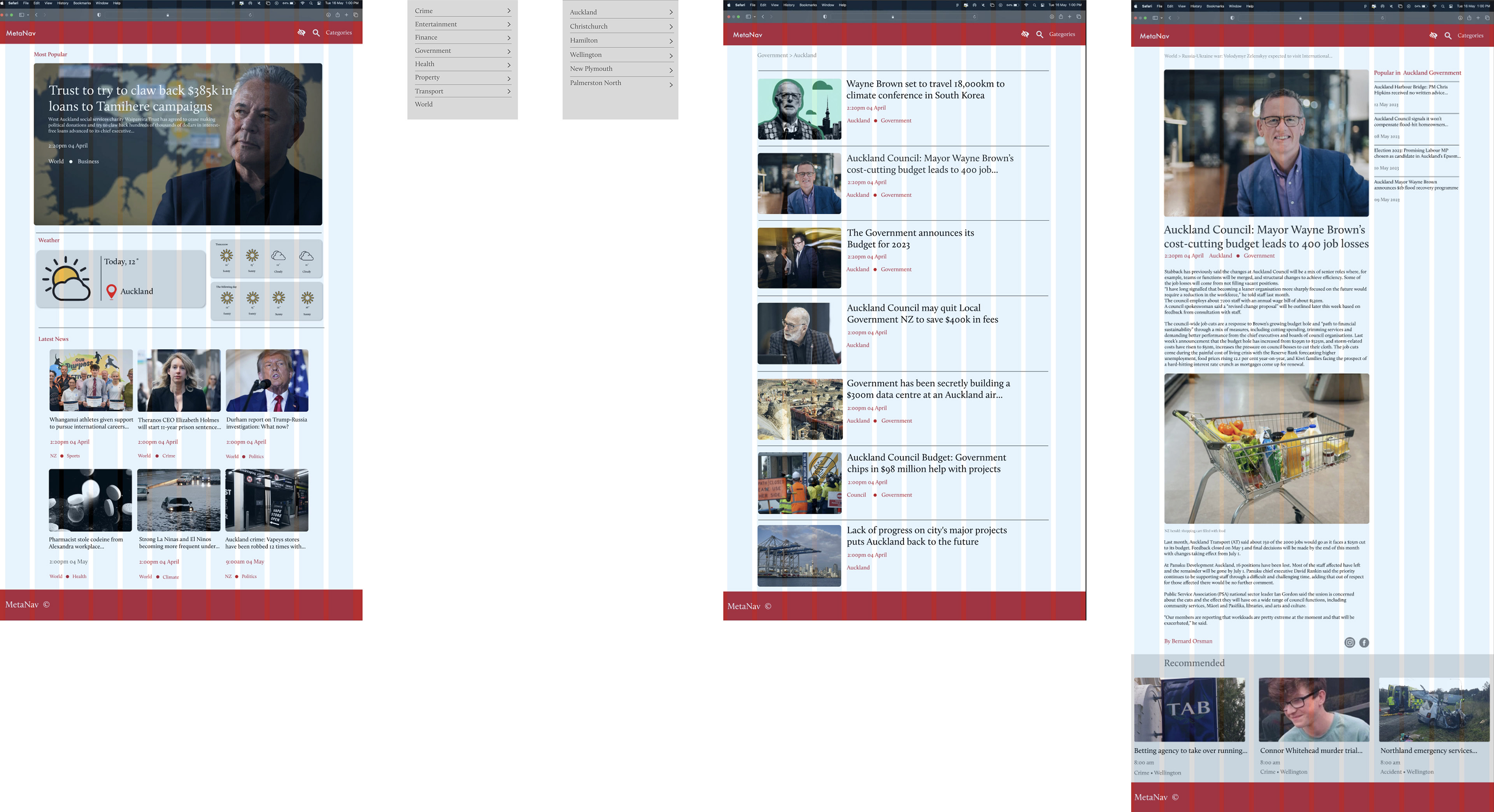
Hi-fi Desktop, Sarah Blake
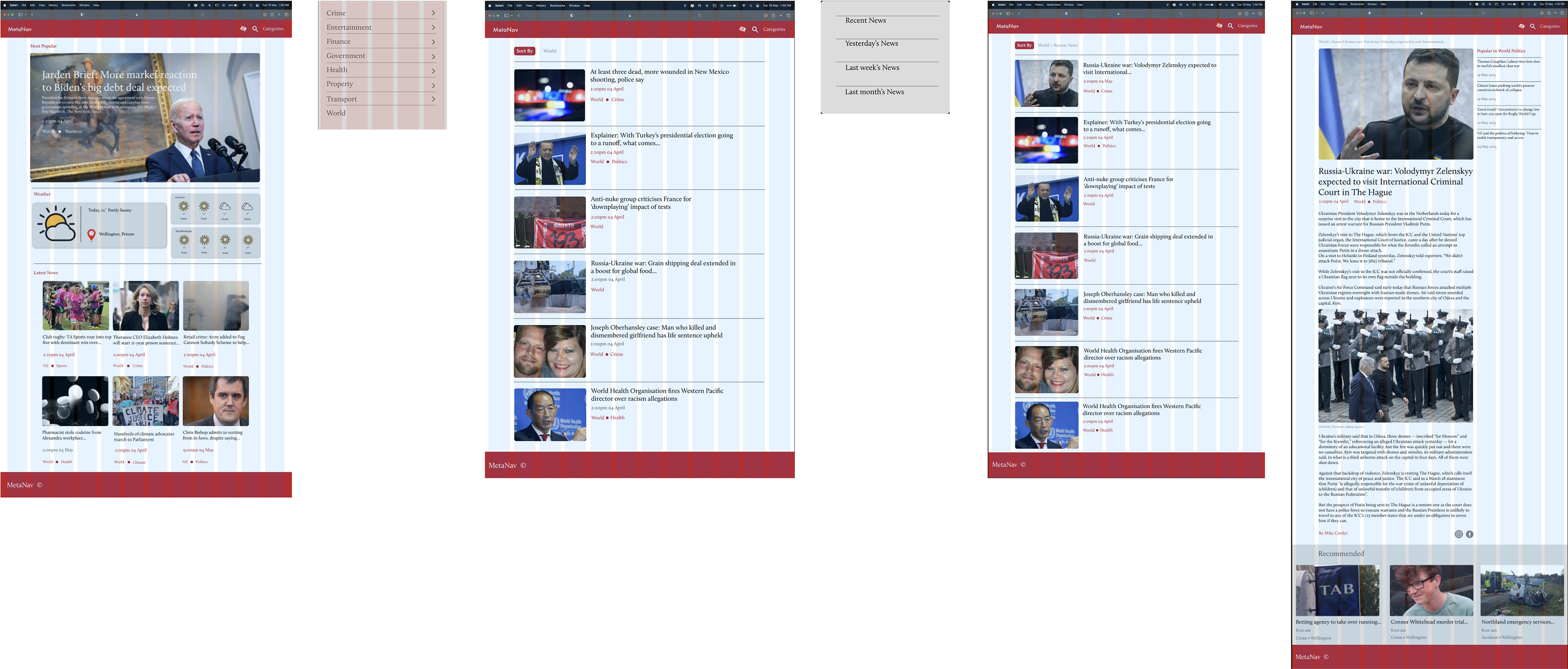
Hi-fi Desktop, Ben Miller
6. Usability Testing
To see how people interact with wireframes and whether the product idea meets their expectations, I conducted several iterations of usability testing.
Style : Moderated
Main Tasks we asked to complete
• Find a recent article about crime in Wellington
• Find an article about recent world news
• Find today’s article on government news in Auckland
• Find a button that will change colour for colourblind people
Main usability issues
The following changes are a few of the things that we applied based on the testing feedback
Usability Issue 1
“Text was hard to read”
Users had a hard time reading the text displayed on the page because of the size of the font.
Before, Text was too small to read
After, Text is bigger making it easier to read
Usability Issue 2
“Hard to find the ‘Sort By filter”
Users had difficulty finding the ‘Sort By’ filter because it blended in too much with the tags.
Before, ‘Sort by’ blending in with the tag
After, ‘Sort by’ made obvious by removing the border around the tags
7. Final Results
User Problem
Users suffer from not having the time to browse through a news website and have trouble filtering out unnecessary information they don’t want
Solution
I have made the filter button more obvious for the user to see and made it easier on the user to find their desired article as well as making the articles easier to read
8. Reflection
Outcome
I have successfully created a news webpage that caters to a variety of audience more specifically someone who has an accessibility problem. I have also created a filter option for the users to make it easier for them to find the recent news without taking up their time.
Takeaway
I realized that in the early stages of prototyping, I often guided the user towards the end goal of the journey. This resulted in inaccurate feedback and less user-centered results. For this project, I need to be more mindful of this tendency and take care to avoid skewing the results towards my own preconceptions.
