1. Overview
Problem Statement
I want to create a user-friendly booking app for the You:Logy cafe. My goal is to create an engaging experience that attracts visitors to the website, encouraging them to explore and learn more about You:Logy, and ultimately book a table at the cafe. To achieve this, I need to design a user interface that is welcoming and suitable for a wide range of users.
Solution
I spent 8 weeks iterating and developing to create a booking website that caters to a wide variety of audiences of different ages.
Main Features
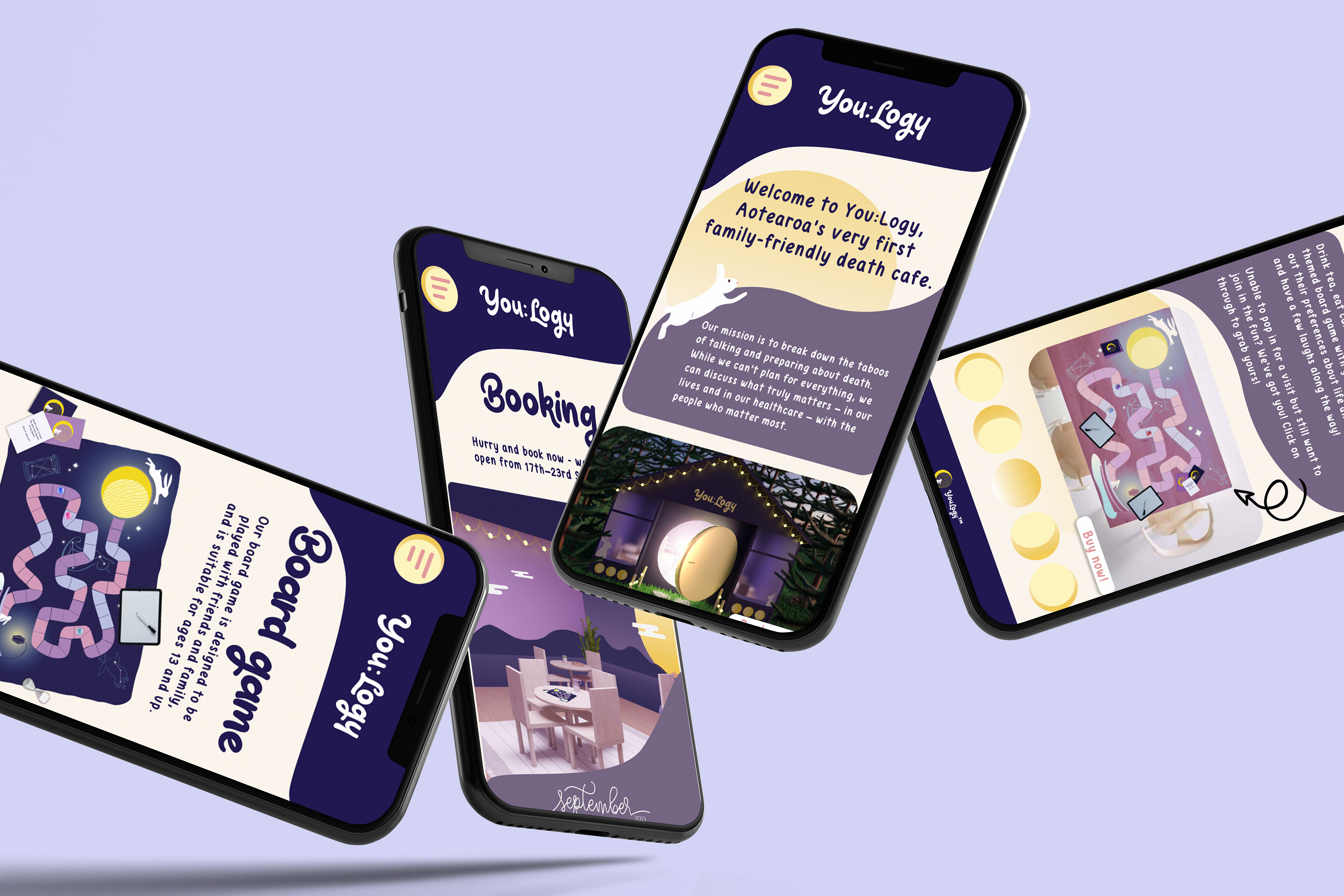
• Calendar • Booking page
• About us page • Board game page
My Role
To begin, I developed lo-fi website prototypes and tested them among users. I progressed to digital wireframes using Figma. Ultimately, a final user test was conducted that allowed me to make the finishing touches to the design.
2. Design Process
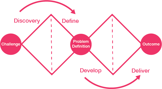
For this project we used the Double Diamond method.
3. Empathize
User Interviews
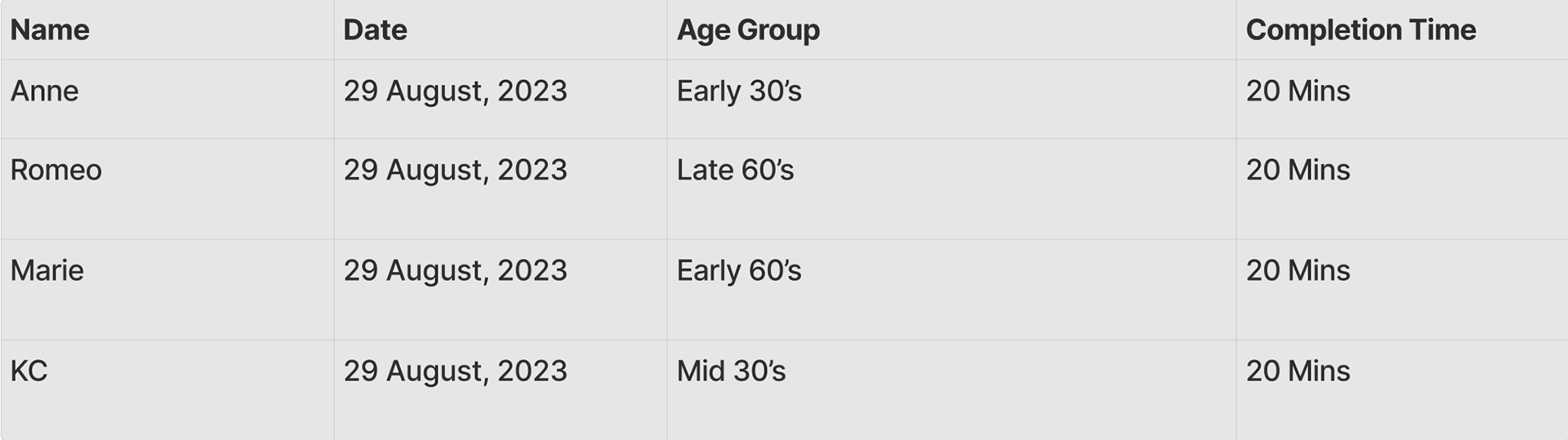
To develop of an understanding of their habits and preferences, and problems, I conducted user interviews with 4 users for 20 minutes each.
STYLE: Moderated INTERVIEW TYPE: 1:1
Number: 4 people Duration: 20 mins
Number: 4 people Duration: 20 mins
Main questions I asked
• What problems do you face when booking a table?
• What would you like incorporated in the website to make the booking process easier?
• What device to you use to browse a news site?
• How do you normally find out about new restaurants?
Preparation
In order to stay organized and take track of all sessions, I used FigJam.
Key Insights
• Majority of the participants prefer to make a phone call because it's convenient
• Most of the participants prefer to use their phone to make a booking
• Participants usually scroll through social media or post shared to them, to find out about new events
• Some of the participants want the booking menu to be easier to find
• Participants want to get a visual layout of the restaurant and menu before booking
Based on the results I obtained, majority preferred to use their phone to make a booking because it was convenient. Most of the participants also want to get a visual of what the restaurant looks like before booking and an easier way to find the booking page
4. Define
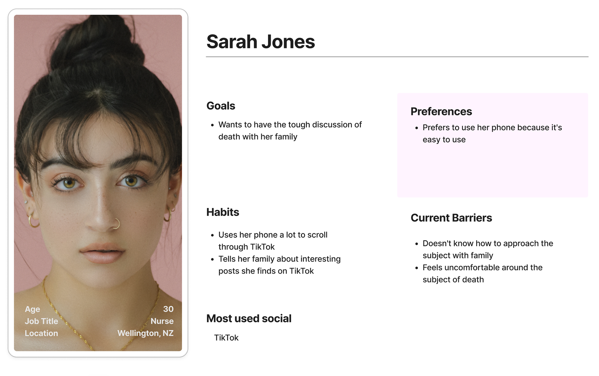
User Persona
From the user interviews that I’ve conducted, I developed a persona that caters to their needs.
5. Prototype
I created low-fi wireframes, followed by hi-fi with Figma, so we can test out our idea
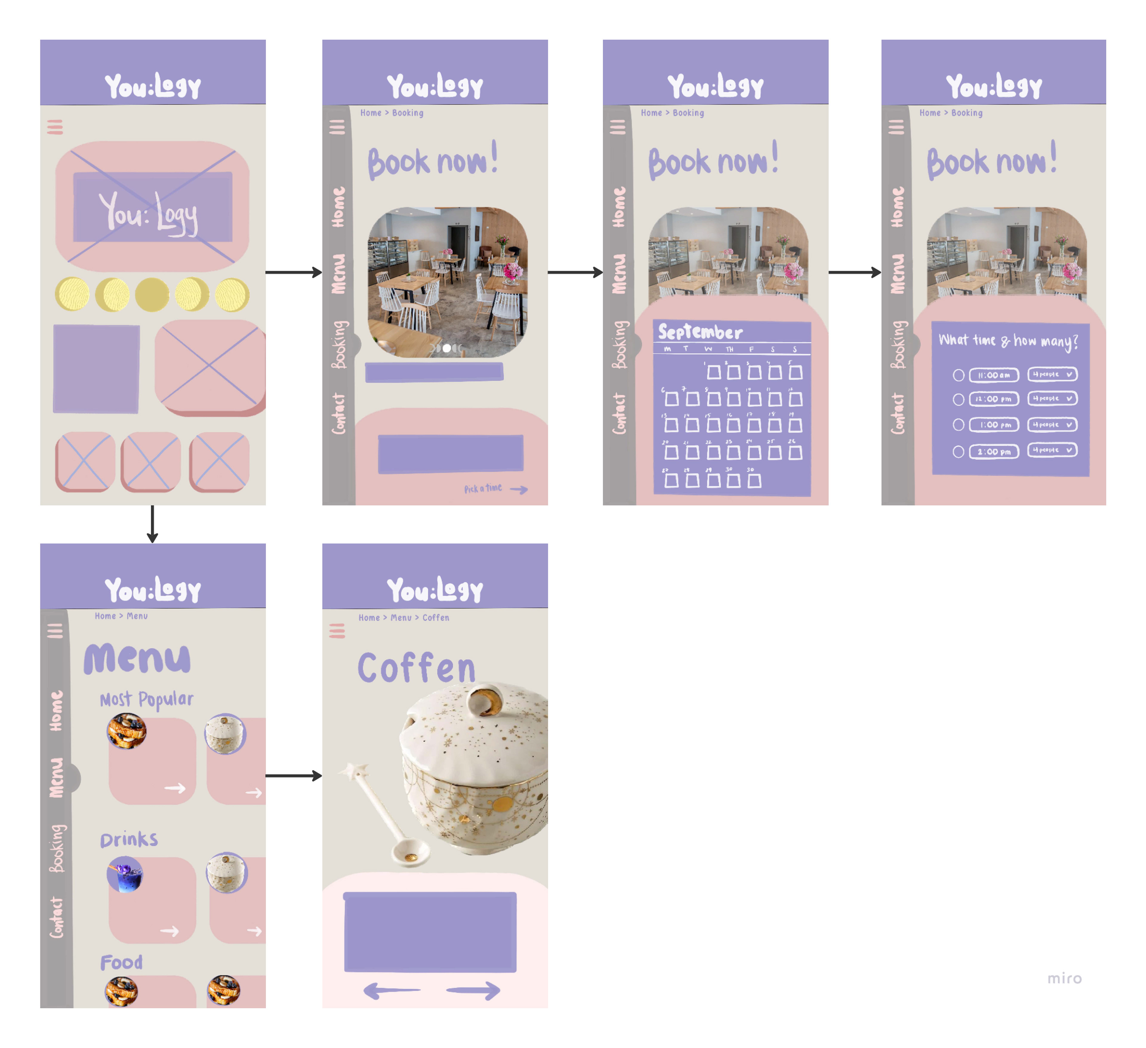
Low-fi Mobile, Sarah Jones
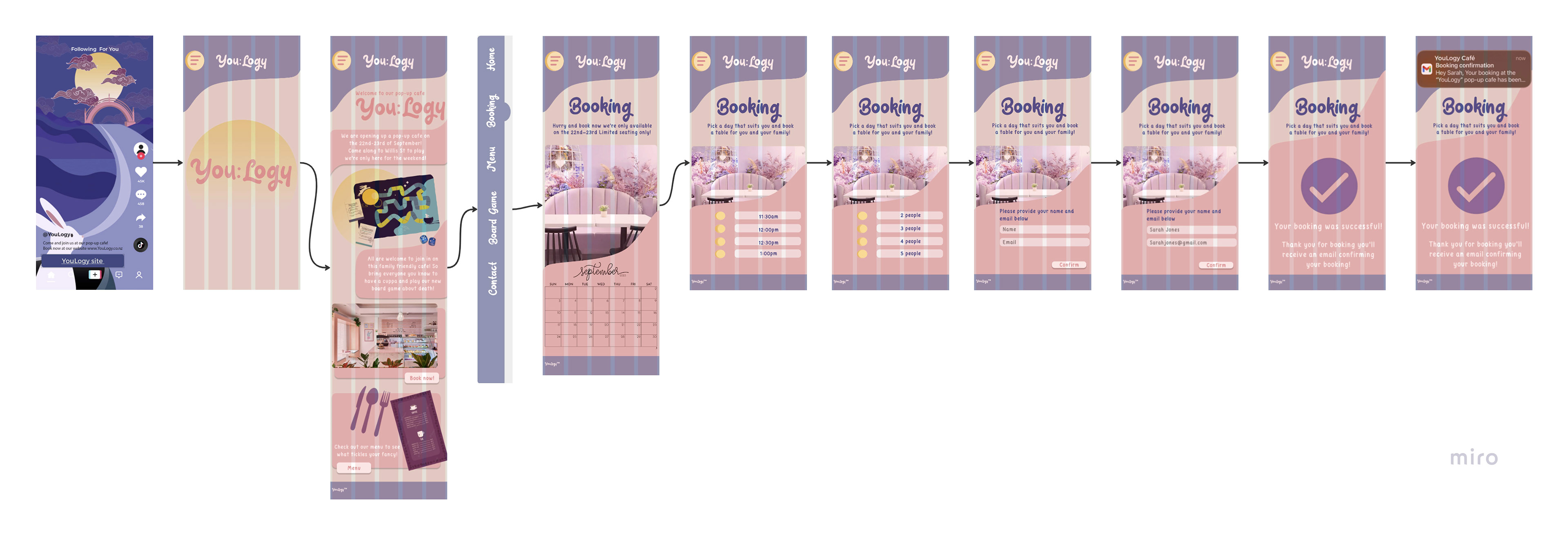
Hi-fi Mobile, Sarah Jones
6. Usability Testing
To see how people interact with wireframes and whether the product idea meets their expectations, I conducted several iterations of usability testing.
STYLE : MODERATED
Main Tasks we asked to complete
• Book a table for you and your family
• Find the ‘About us’ page
• Find information about the board game
Main usability issues
The following changes are a few of the things that we applied based on the testing feedback
Usability Issue 1
“Text is little hard to read on the eyes”
Users had trouble reading through the site because of the colours.
Before, colours were too light to read text
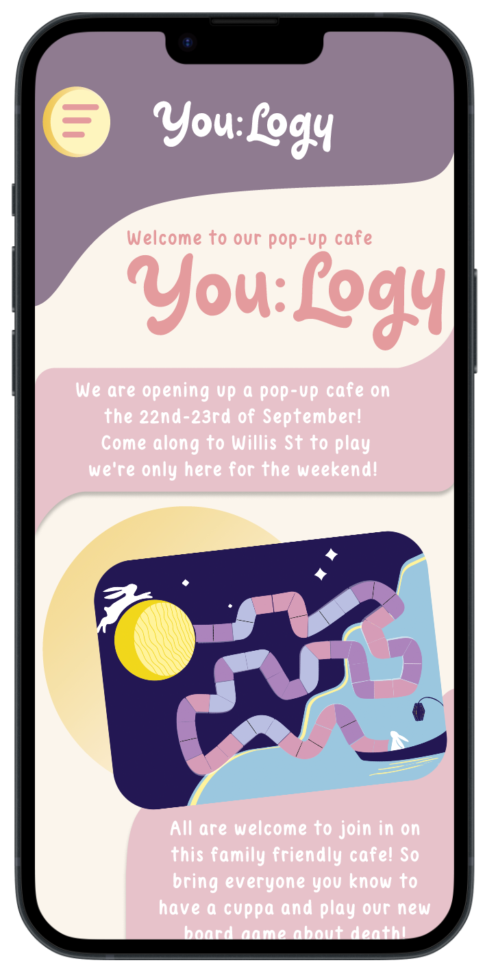
After, changed colour palette and homepage layout to make the text more readable
Usability Issue 2
“I don’t know which days are available”
Users had trouble figuring out which days were available.
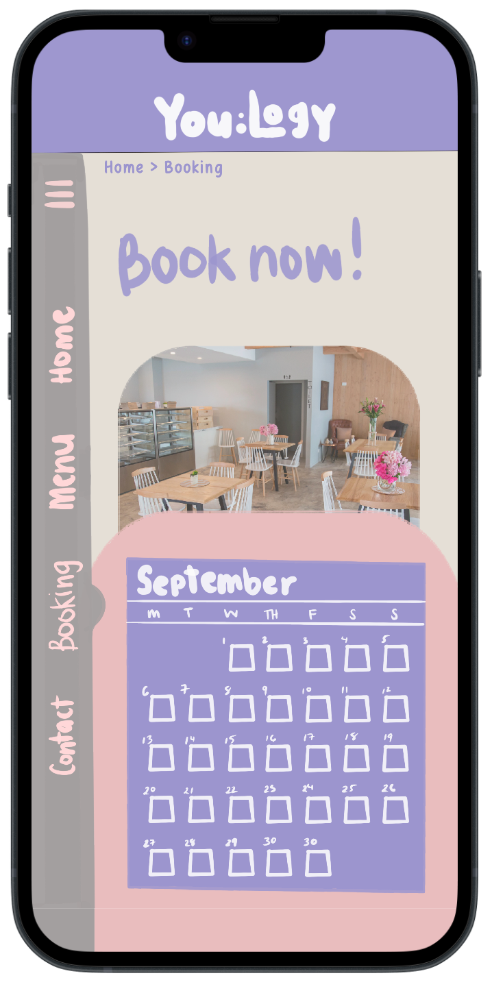
Before, couldn’t read the numbers because they were too small
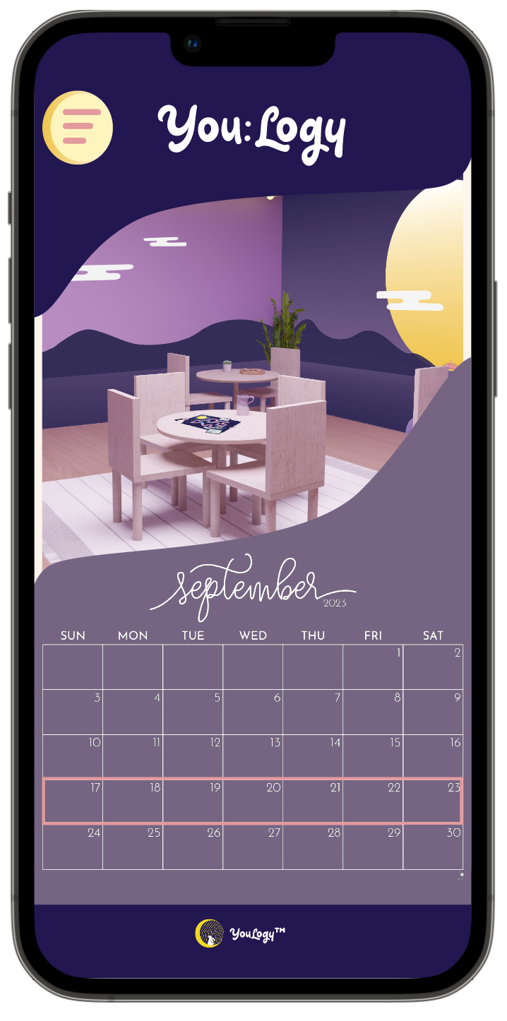
After, added a proper calendar and highlighted which days were available
7. Final Results
User Problem
Users struggle with finding a way to make the booking process quick and easy.
Solution
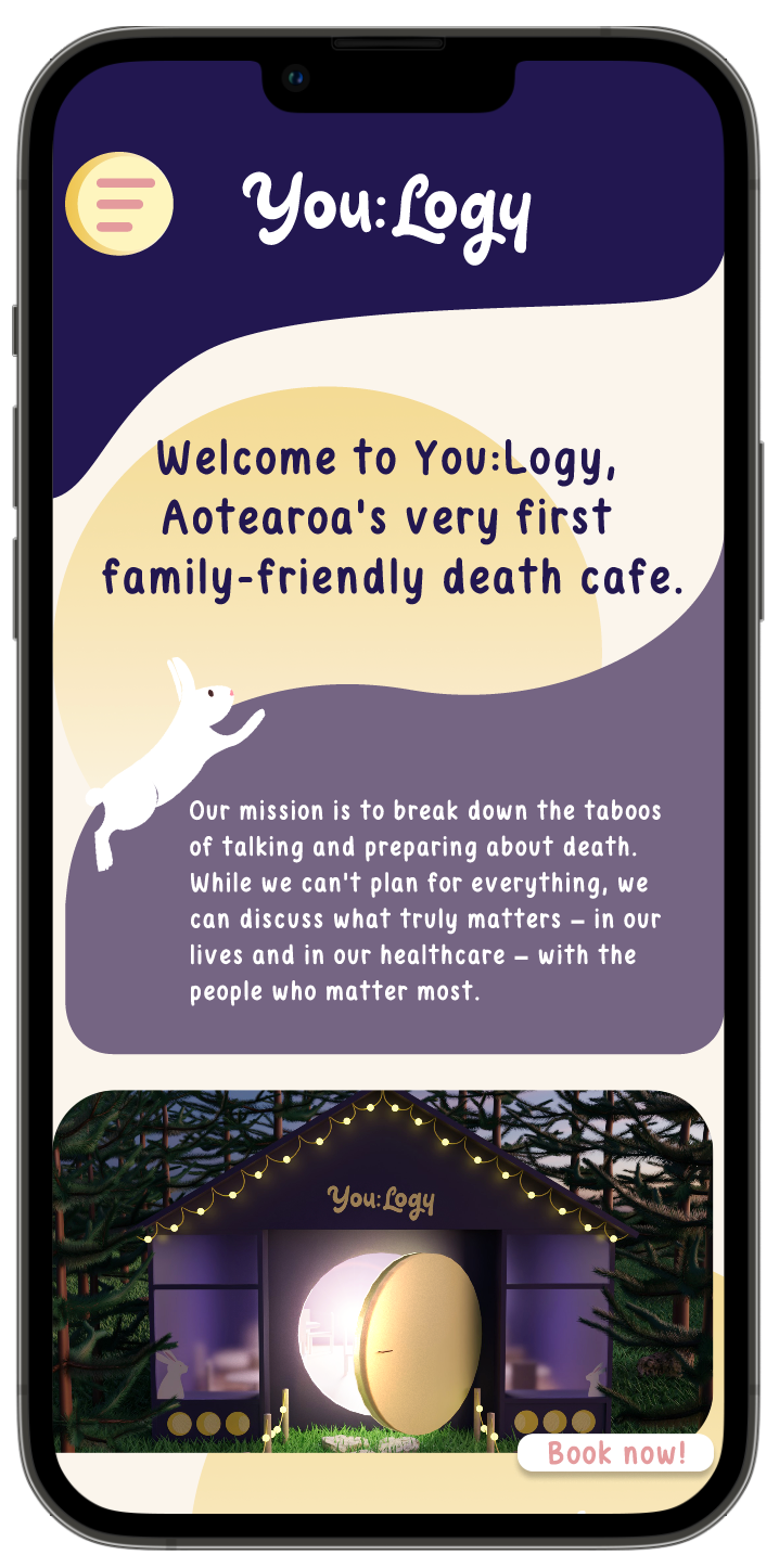
I have made the booking process easy by allowing users to book with just a few clicks. Additionally, I have made it clear for the audience to easily locate the booking page.
8. Reflection
Outcome
I have successfully created a booking site that caters to a variety of audiences. Additionally, I have improved the booking process to make it quicker and easier for users of all ages to navigate. By adding a menu button, people can easily access the available pages and find their desired content more efficiently.
Takeaway
In the early stages of the prototyping stage, I realised that I need to work on my colour palette and how to use contrast to my advantage. Another would be the layout of the homepage